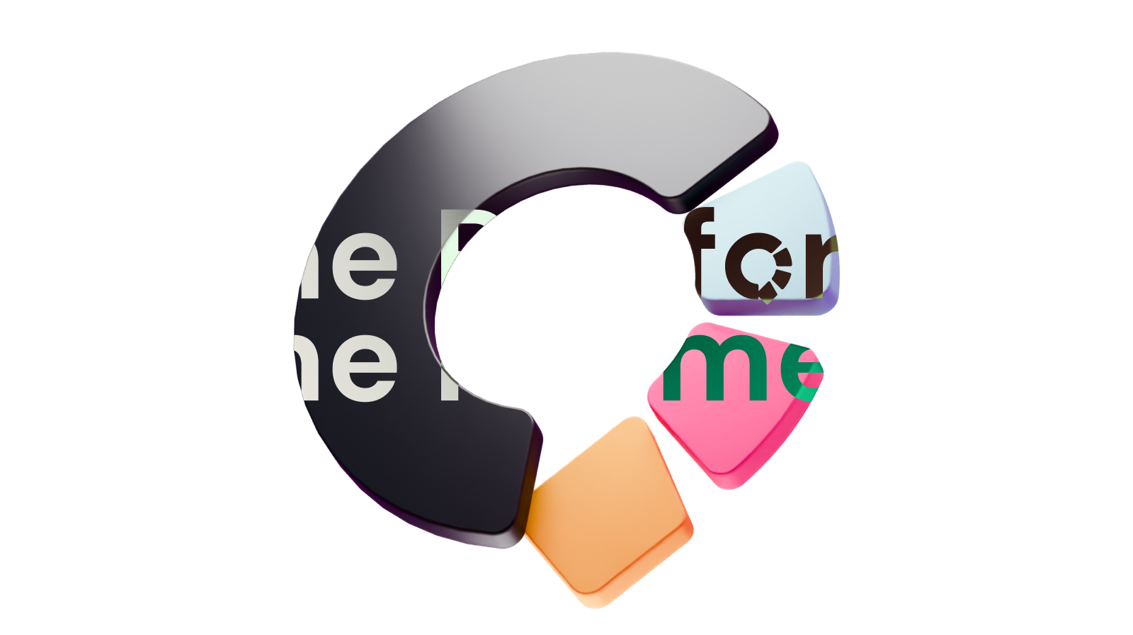
This is an all-in-one platform for creating communities. I’ve worked as a designer on this project since 2023. This is the latest iteration of Communi’s brand identity.
Branding
What I wanted to convey is a sense of humanity and approachability. The sign is a speech bubble and the three colored shapes are the three main features of the platform: communities, courses and events.

I use gradients with noise throughout the branding to contrast the modern vibe of the software with the bespoke crafted nature of it. The noise adds tactile texture and combined with the gradient, the message is clear: this is a modern platform created by humans for humans.
Applications
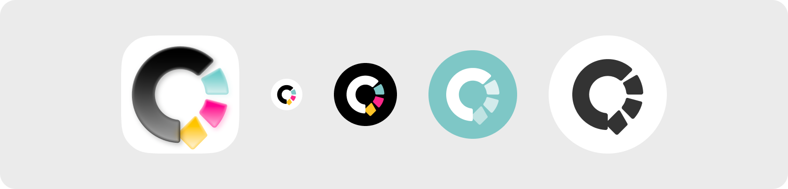
The mark needs to work in different contexts, sizes and backgrounds, such as app icon, monochrome and light / dark themes.
Logotype

The logotype is a custom constructed geometric font. The bubble in the o echoes the mark's chat bubble motif.
Evolution
Evolution of the mark. I moved through several different versions. The first version combined a smile with a speech bubble and a graduation cap. Although this is a good mark, we felt that we needed to de-emphasize the focus on courses.



The second iteration of the logo already contained the bubble idea but was a weaker shape due to problems with readability in grayscale and small sizes. The C was not distinct enough and the bands symbolizing the different aspects of the software blended together.
Colors
-
 Community
-
 Events
-
 Courses
The palette itself is using a mix of pastel and vibrant colors that reiterate the main theme of humanism and approachability as well as separate the three main pillars of the platform.
UI/UX
Throughout the early stages of the platform, I’ve worked on the unique and inviting user interface. The main vision was to make an interface that is fun to use. The secondary goal was to make the interface invisible and unobtrusive. I wanted creators to really feel like they own their groups, which includes the ability to adapt to their brands without the interface getting in the way.
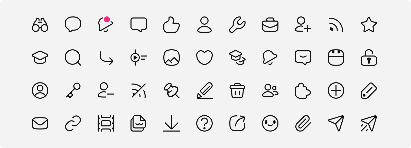
In addition to screens, I coded animation prototypes, designed 3D graphics and iconography to achieve this goal.
Community
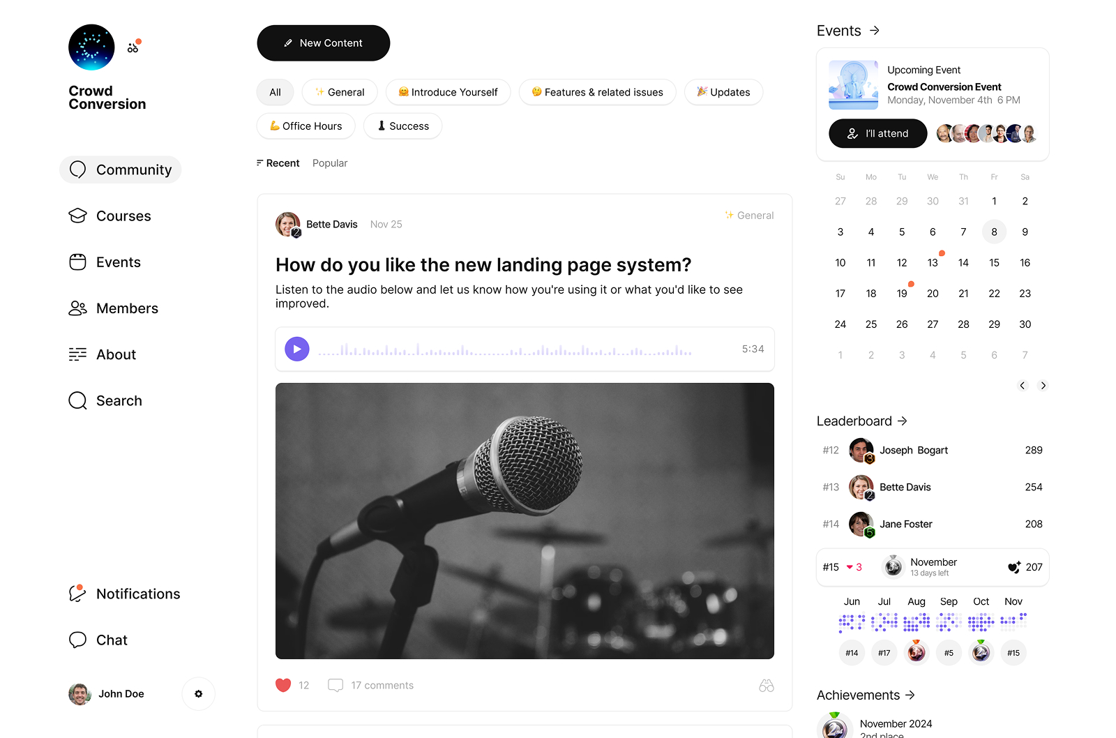
The main challenge was to make the group feel like one coherent place. Courses, events and community combine together and create something that is more than just the sum of its parts.
Courses
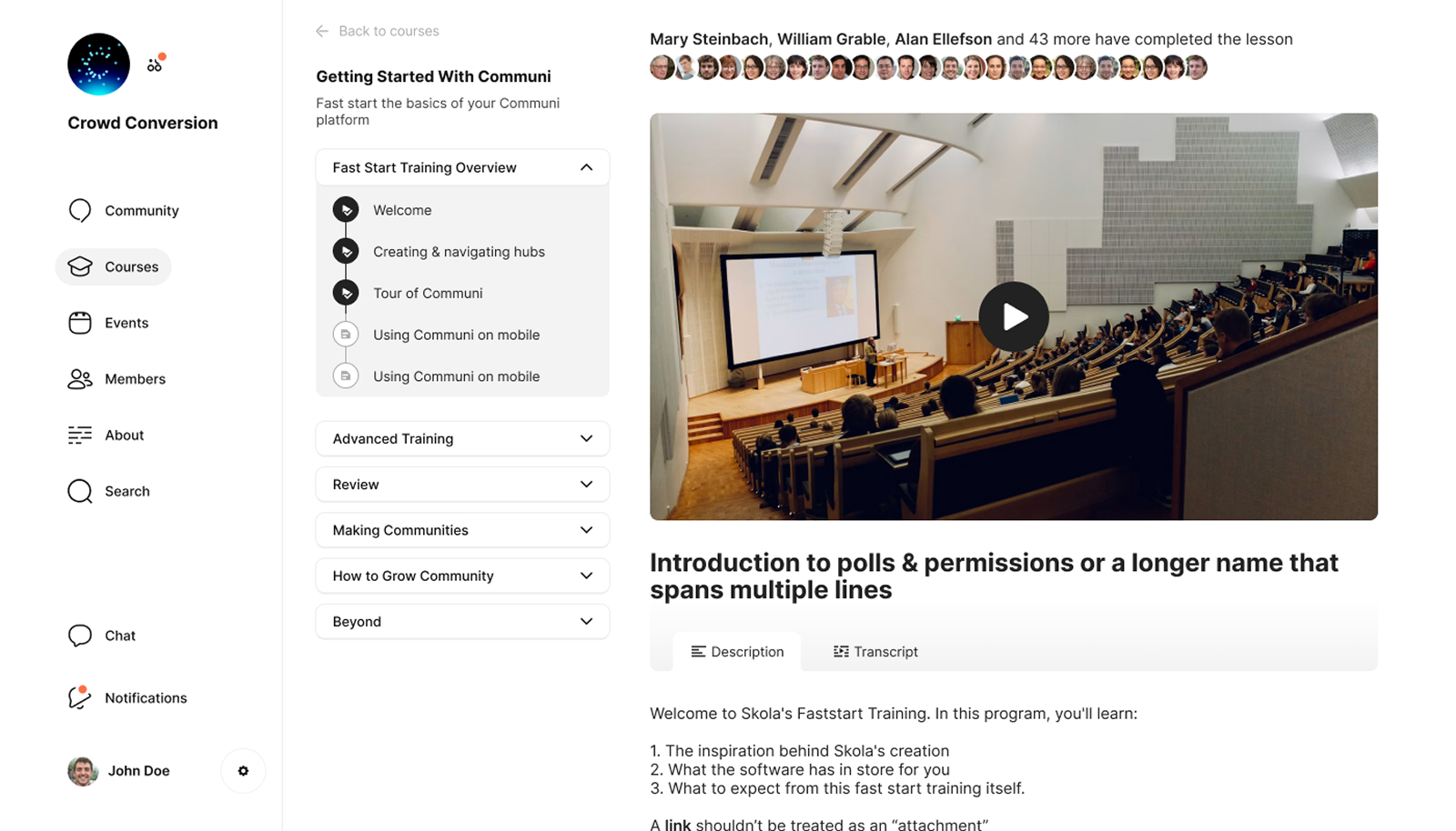
When you start a lesson, for example, you see how many other members you’ve interacted with have already completed it.
Events
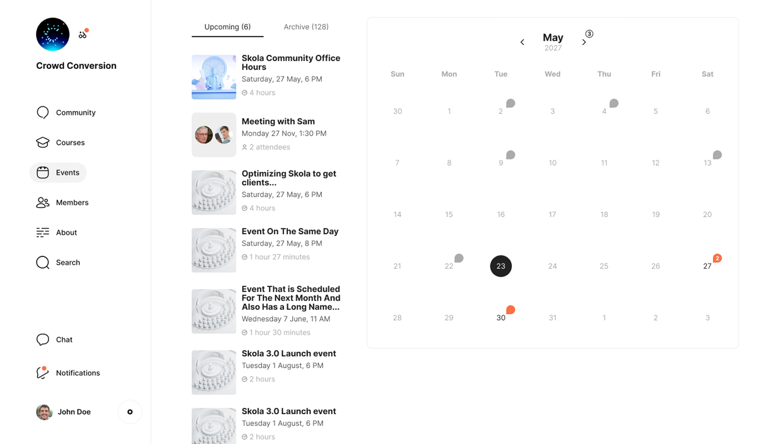
Events are an essential feature of the platform. Users can see an overview of all the planned events and who committed to attend.
Gamification
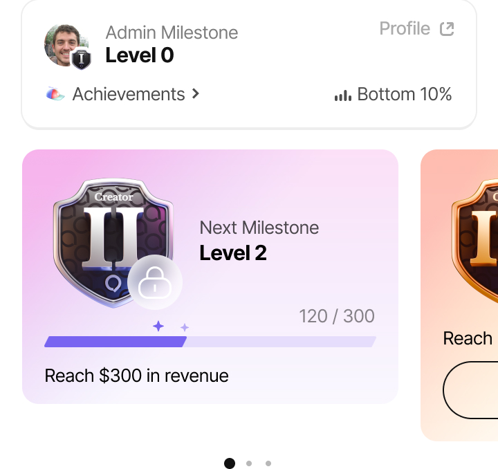
One of the most important features is gamification. We wanted to provide members with something to work towards and an easy way to track progress.

We also felt that it is important to make the group creator experience delightful. Admins have challenges to complete and achievements to earn. Starting with an empty group can feel disorienting and daunting so we guide creators through the process of filling it up.
Graphics
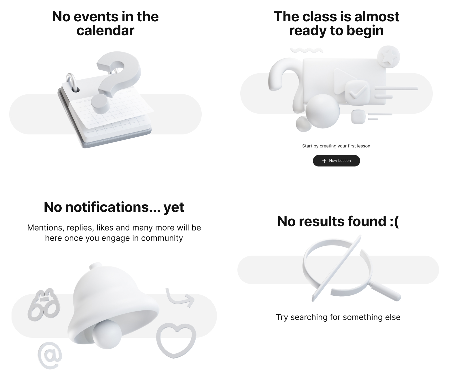
I used 3D graphics throughout the interface to help with the frustration when encountering default empty states.
Iconography
Landing page
I designed a landing page complete with implementation. For this project, I used a Figma MCP → Claude workflow that let me deliver the page in a much tighter timeframe while still retaining full creative control, because the design was fully hand-crafted. At the time Claude would still make mistakes so I had to jump in and edit HTML/CSS manually for quite a few sections.
Live pageHero
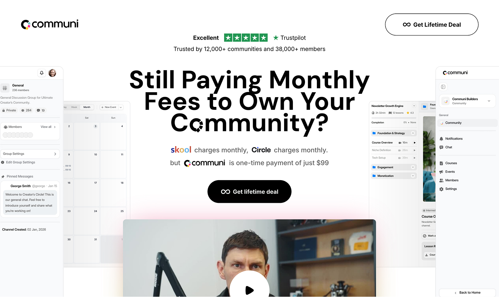
For the headline, I wanted to reiterate the branding by using the mark instead of the o in community. I’ve used a custom font with the Communi mark as a special character.
Features
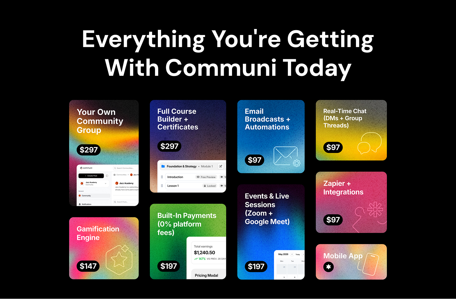
The box areas correspond to the dollar amounts. Again I use the brand gradient with noise for the tactile yet high-tech feel.
Packages
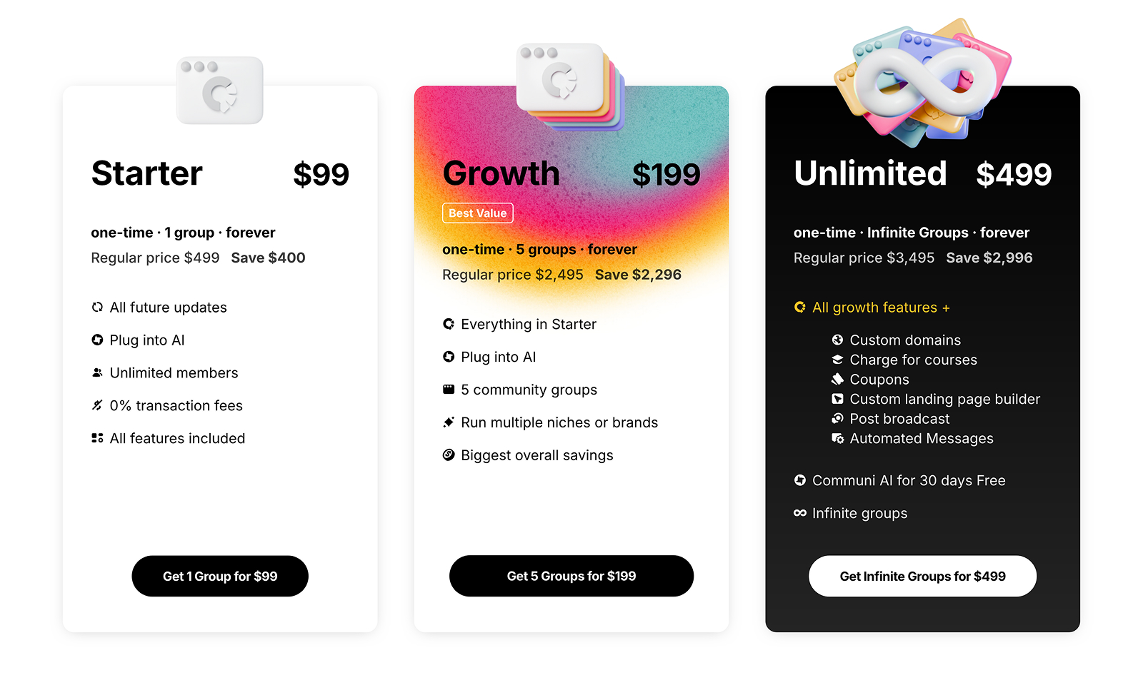
3D illustrations are used to provide visual candy and further differentiate the packages.
Conclusion
The work on Communi has taught me many things, including how to put users’ interests ahead of my own, the importance of listening to feedback and having the humility to adjust the strategy on the fly.